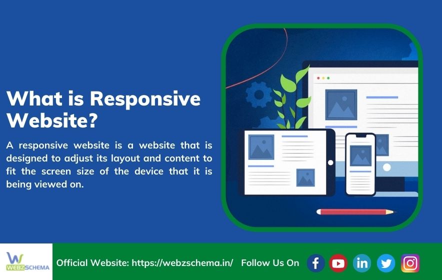
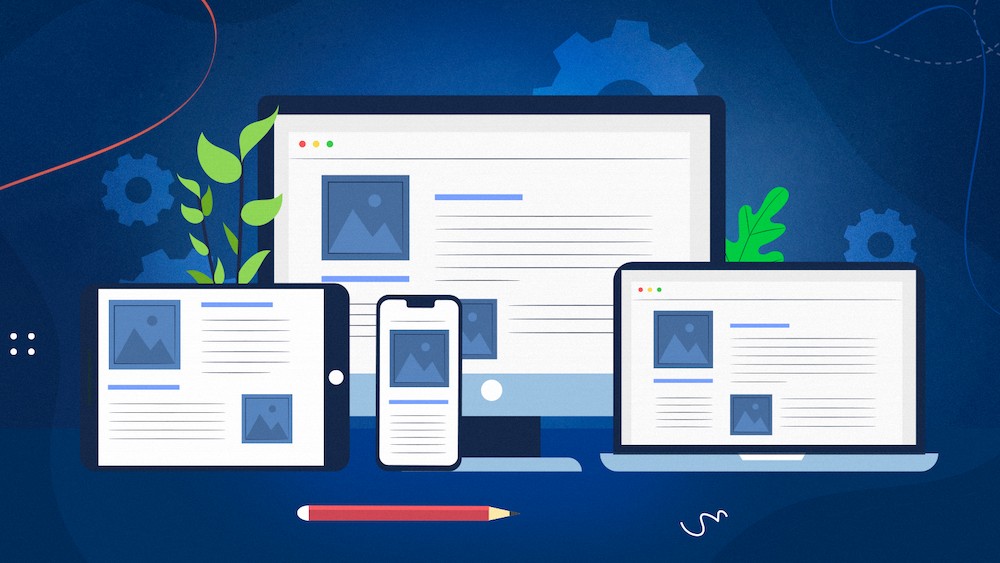
A responsive website is a website that is designed to adjust its layout and content to fit the screen size of the device that it is being viewed on. This means that whether a website is being viewed on a desktop computer, a tablet, or a smartphone, it will be able to adapt its appearance to provide an optimal experience for the user.
Benefits of Responsive Design:
One of the main benefits of responsive design is that it makes it much easier for users to access and use a website, regardless of what type of device they are using. This is especially important in today’s market, where there is a wide range of different devices and screen sizes being used.
Another benefit of responsive design is that it can help to improve a website’s search engine optimization (SEO). This is because search engines will be able to index a website more easily if it has a responsive design. This is because responsive websites use a single URL for both desktop and mobile versions of the site, which makes it easier for search engines to crawl and index the site.
If you want to create a responsive website, Webzschema is the best place to create a responsive website. We provide responsive web design services that help you create a website that looks great on all devices. We use the latest technologies and trends to create a responsive website that is easy to use and looks great on all devices.
Finally, you will need to test your website on a variety of different devices to make sure that it is responsive. You can use a tool like Google’s Mobile-Friendly Test to do this.
Overall, responsive design is a great way to improve the user experience of your website and to improve your website’s SEO. If you want to create a responsive website, make sure to use RWD principles, have clean code, and test your site on a variety of devices.
Technical Challenges of Responsive Web Design Explain:
There are a few technical challenges that come along with responsive web design. One challenge is that not all browsers support media queries, the CSS3 feature that makes responsive design possible(Latest browsers have support for Media queries).. Another challenge is that responsive design can be a bit more code-heavy than non-responsive design, which can make it more difficult to develop.
List of Tools to check Mobile friendly website:
There are a few different ways to test if a website is mobile friendly.
Web browser developer tools can be used to check how a website renders on different screen sizes. To do this, simply open the developer tools panel and change the width of the browser window. The website will automatically adjust to the new width, allowing you to see how it would look on a smaller or larger screen.
Dedicated responsive design testing tools are designed specifically for testing responsive websites. These tools allow you to enter a website’s URL and view how it looks on different devices, including smartphones, tablets, and desktop computers. Some responsive design testing tools even allow you to view how the website would look on different screen resolutions.
The first tool to use is Google’s Mobile-Friendly Test. This tool will analyze a URL and report if the page has a mobile-friendly design.
The second way is to use a https://responsivedesignchecker.com/. This is a tool that allows you to view a website as if you were on a mobile device. This is helpful to see how a website looks and functions on a smaller screen.
The third way is to use a https://www.browserstack.com/responsive . This tool will show you how a website looks on different browsers. This is helpful to see if a website is responsive and looks good on all devices.